case study - Color Frame and Places COLLECTIONs
A health-centric and vibrant new office for Virtusa at Pune.
Spread over an entire floor, the IT giant's new office designed by Zyeta offers an innovative and forward-thinking work environment that has become a vital aspect of their employees’ lives.
To align with the thought process of the organization, Team Zyeta conceptualized a design outline that epicenters the employees' comfort with dedicated spaces to collaborate, innovate, and rejuvenate.
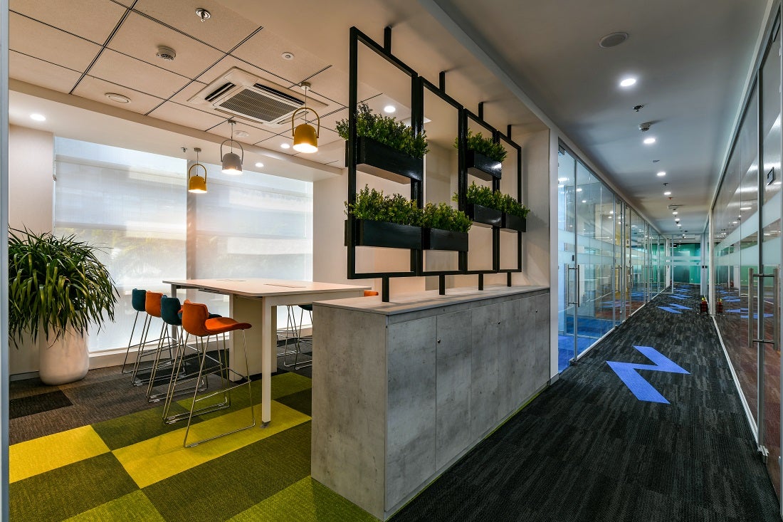
Design insight: Balancing space and natural light
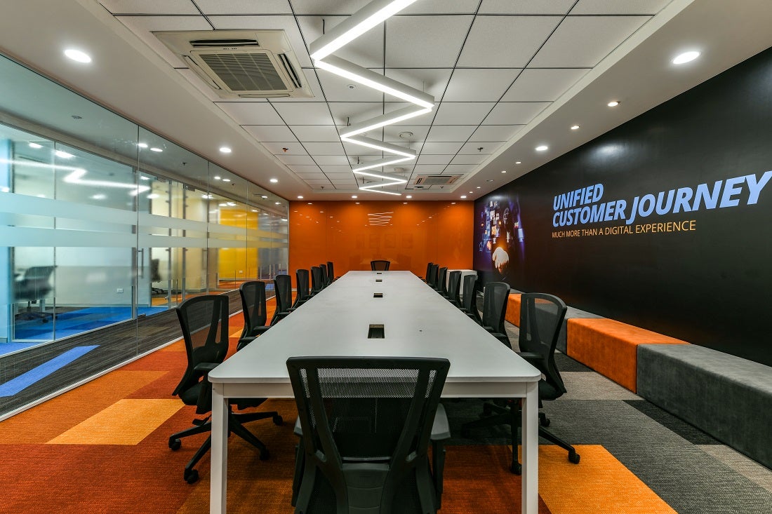
Team Zyeta seamlessly segregated the main floor and the service areas to maintain a proper but uninterrupted division between the two.
This approach ensured alignment with the organization’s demand for creativity and innovation in the workplace design.

The next highlighting and in fact, a defining design element for Virtusa Pune's office is the flooring.
Two collections – Color Frame and Places - were used for the project. The checkered and zig-zag patterns in orange, blue and green also matched Virtusa's global brand guidelines, and directional aesthetics.
Balancing space and natural light
Optimizing the inflow of natural light for employee wellness. An epicenter of comfort and space to collaborate, innovate, and rejuvenate.
Shaw Contract’s PLACES collection: Collaborative workplace to quiet retreat
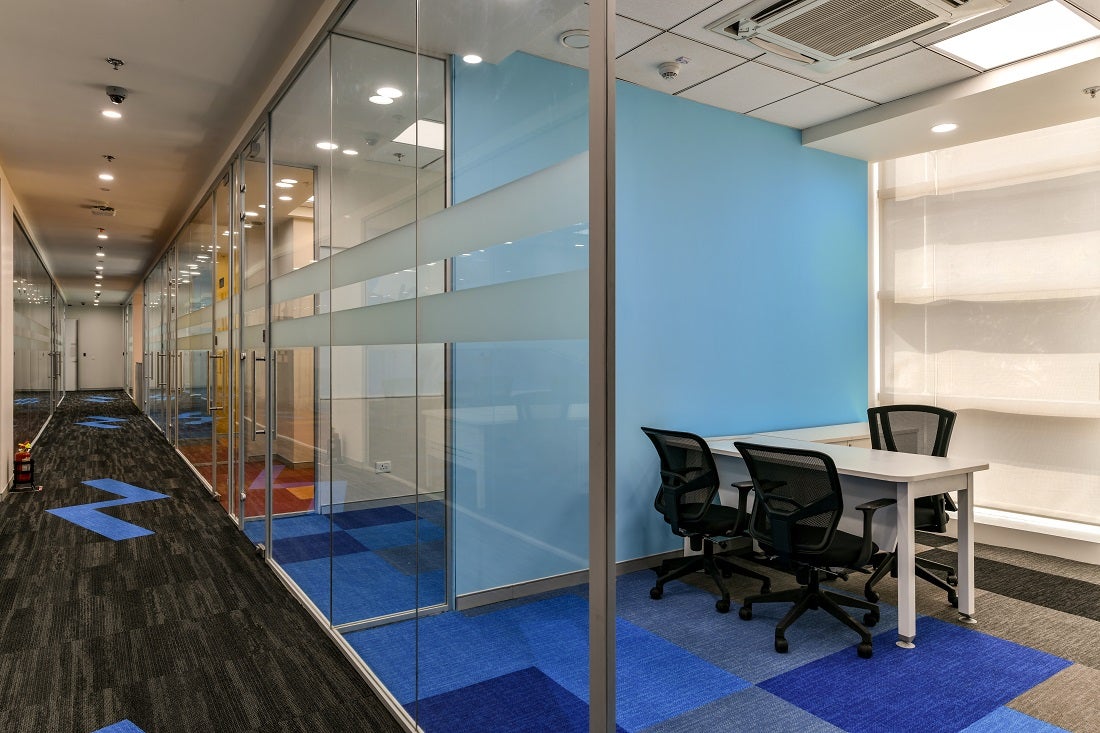
Result: A visually appealing workplace that encourages comfort and wellness.
The new workplace underlines deep detailing and innovation to create an atmosphere that uplifts work culture and work efficiency.
It is a lively, bright workplace, supported by biophilic design elements, where one can easily and comfortably spend hours every day.
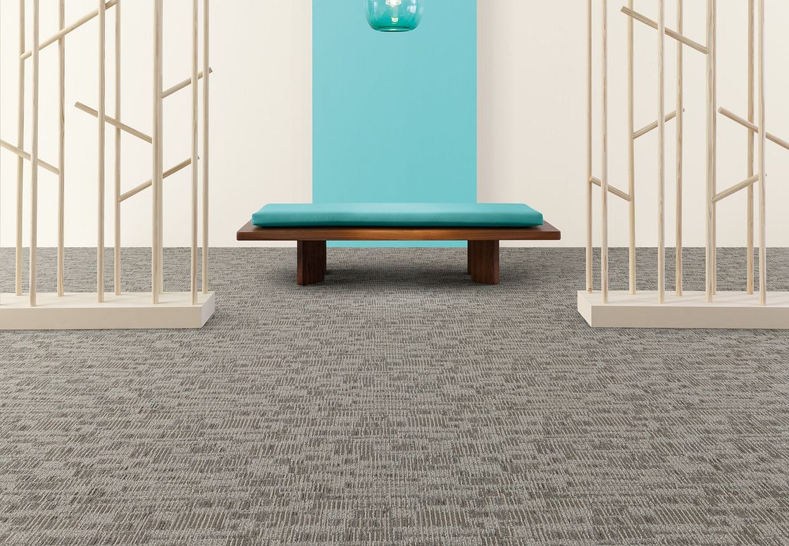
The Places Collection
Spend the day in a vibrant metropolis. Explore the shores of a coastline. Take in the moment. City to sea. Local to global. Collaborative workplace to quiet retreat.