2023 Design Awards
Wellington Child and Family Centre
by AOA Christopher Peck
Best of Region Winner
All photography by Veeral
Design Inspiration
Two separate outmoded buildings were used for decades before this new child and family centre arrived in Mulgrave, Melbourne. One built around the 1960s was used by the preschool children (ages three and four), while the 1930s building, once a detached house, focused on maternal health. But with new families with younger children settling into the area, it was time for The City of Monash to look to the future. Designed by AOA Christopher Peck, the new child and family centre not only embraces the corner site but was conceived around established trees and landscape.
The new scheme (approximately 600 square metres in area), with a fan-like arrangement, centres on one of the eucalypts engaging with the landscape. The building features two wings separated by a generous and curvaceous corridor, which is used to extend the teaching space. On one side of the centre, linked to the courtyard, are two separate rooms for the children, one for the three-year-olds, with the other used by four-year-olds. And at the ‘knuckle’ is a bathroom, a staff office, and a storage area.


I like this understated scheme which has stunning architecture that is complimented and celebrated by the interiors. This project has created an environment where kids can explore through new ways of teaching and learning. I love the outdoor learning spaces which have a connection to nature, whilst the internal learning spaces expressed that same connection to nature with flexibility that would cater to multiple activities and different levels of learning.”
- Ingrid Kelly / Associate Director at COX Architecture

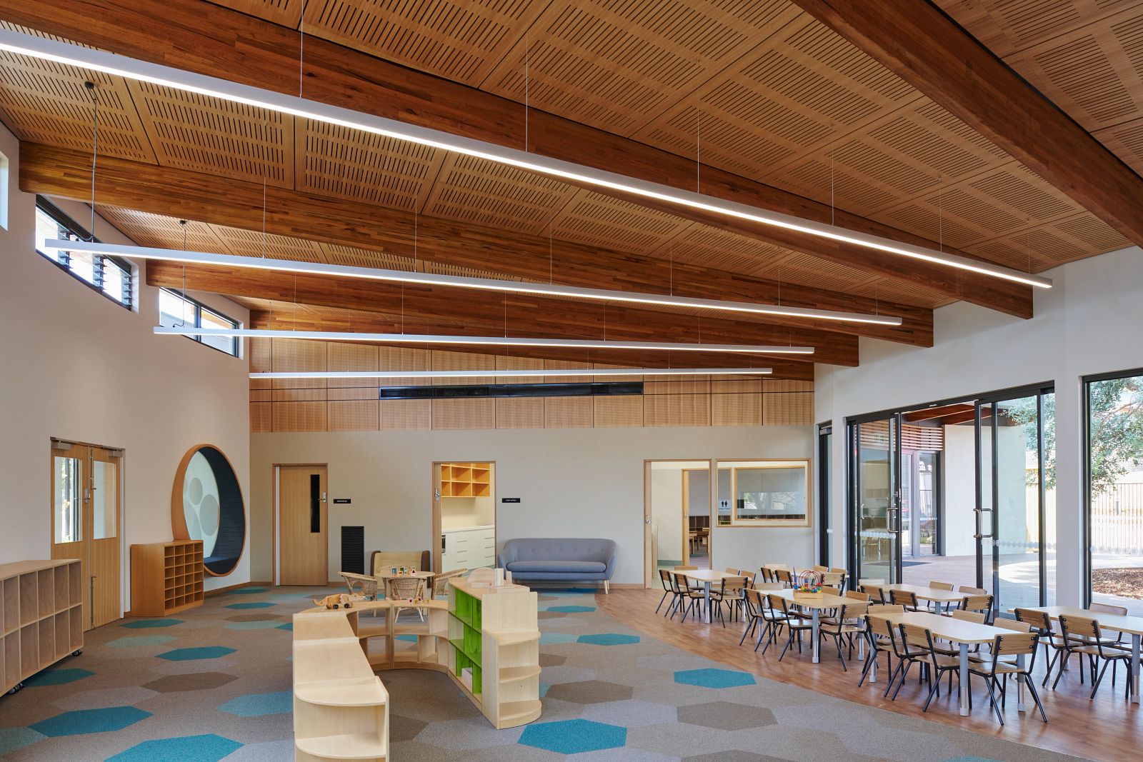
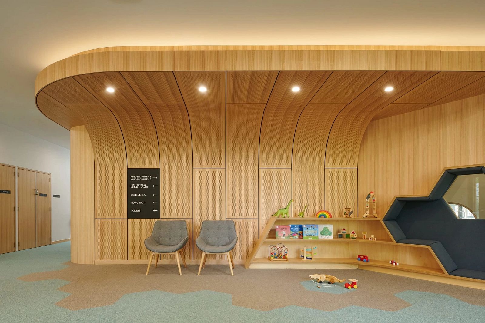
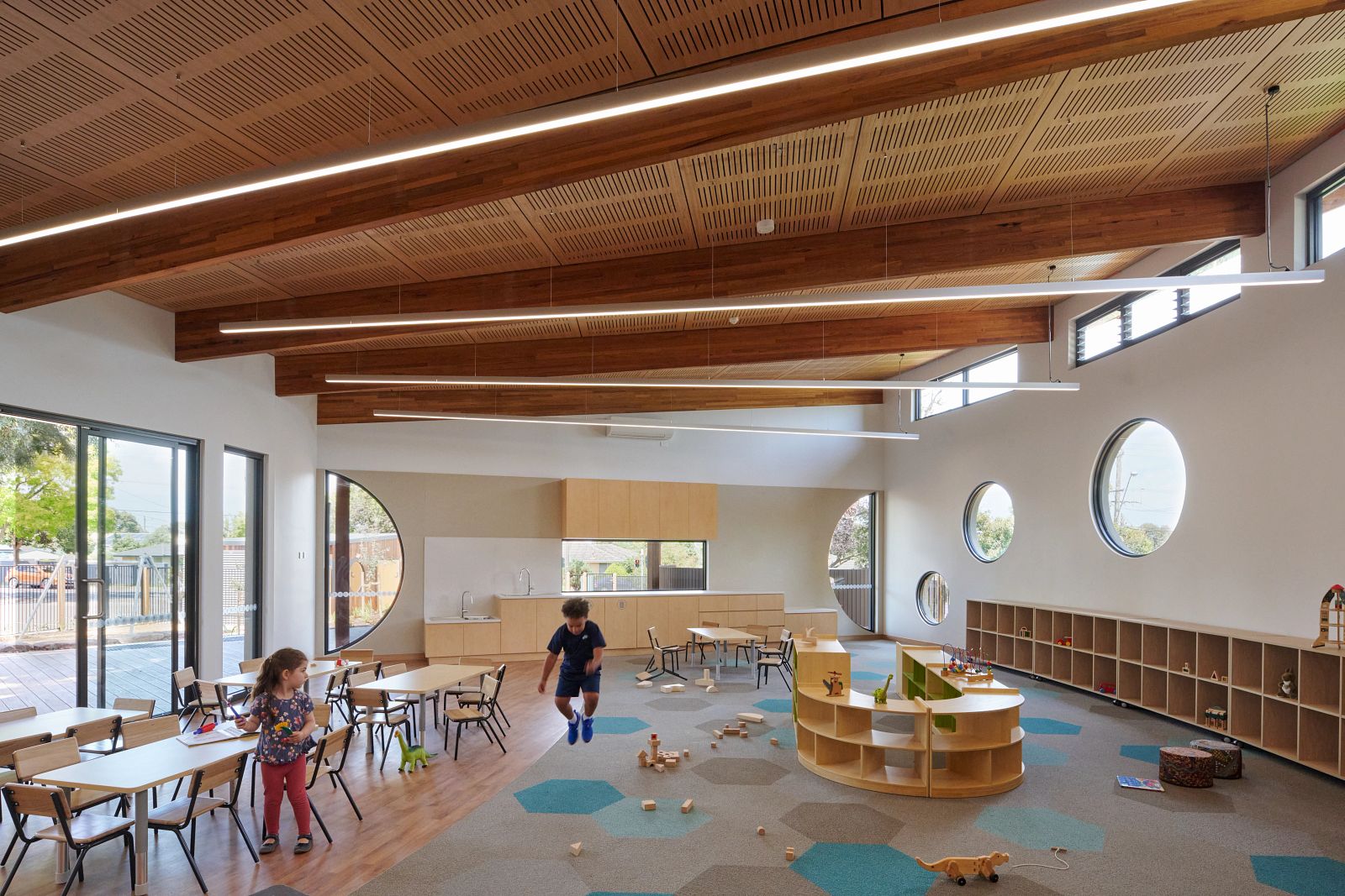
Conceived for young children, there’s a playful quality to the classrooms. There are unimpeded sight lines throughout the building with overscaled porthole-style windows, evocative of a submarine and mindful of the scale of built-in furniture. The building responds to its audience by including built-in origami-shaped furniture in the library that forms part of the centre’s entry sequence. Notably, the internal materials are plain and neutral in colour as the canvas, while the children provide the colour.
The building itself is curved in plan and its sloping ceilings vary the volumes in section. This deliberate move creates cozy spaces and more voluminous, light filled rooms for play. We utilised Shaw Contract Plane Hexagon Tile to interact with the curved and straight walls. With a random pattern combining blue and grey tones, the children use the octagonal-shaped carpet tiles for floor games. Jumping from ‘island’ to ‘island’ or gathering toys on selected blocks of colour, the floor plane becomes an active part of the children’s games.
The original design was all about opening up the facility and making it more accessible to the community - that was the intent and that’s what the building is now doing. Some of the early childhood teachers have said it is one of the most visually connected, easily surveyed buildings they have worked in. And while buildings and landscape were once seen as two separate and disconnected entities, the children now enjoy exploring both, from climbing on rocks in the landscape to carpet tiles inside, to the many interstitial spaces between.


This is one of my favourite projects due to the successful way spaces have been designed to support student-led learning. The connection of indoor and outdoor is done well, with outdoor play spaces paired with large flexible interior spaces that can be reconfigured in lots of different ways. The natural materials and colour palette within the interior is thoughtfully done, especially when paired with generous ceiling heights. The Hexagon carpet tile is a simple yet clever way of creating a play surface for children to incorporate into their activities. It is a fantastic example of what early learning can be.”
- Amanda Moore / Associate Principal - Interior Design at Wardle


Featured Product
Plane Hexagon Tile
Hexagon reflects the cultural shift toward more collaborative environments - influencing the ways we work, walk, communicate and create. Experience collaborative chemistry. It's geometric genius..